VENU
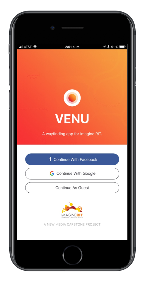
VENU is a wayfinding application created specifically for Imagine RIT, a festival of creativity and innovation held every year at Rochester Institute of Technology. We recognized that large events like Imagine RIT are hectic and confusing to people. Finding a specific facility or booth is frustrating, and other attendees miss out on great opportunities during the event.
Goal
With VENU we wanted to create a personalized experience by making recommendations based on interests and helping navigate large events such as Imagine RIT. We wanted to test our app on this festival as over 30,000 people attend each year.
Project Details
Role
For this project my main role was working as the developer for the app. After some deliberation with the team over to create a mobile or a web app we settled on creating a web app since it was more accessible for users to access it via the browser than having to download an app from the store. Since our app was targeted at Imagine RIT, an event held only once a year we figured more people would be willing to try it out if we minimized the hassle.
Technology
To create the web app I decided to create the front end with React and manage the state with Redux. Since it was my first time working with that library and doing any sort of flux-like state management I decided to try out some tutorials to get to know React. For the backend we decided on using Firebase as it allowed us to utilize their Authentication and Realtime Database with ease and allowed me to focus on the front-end. We also ended up using their Hosting platform to host the app.
Final Product
Onboarding Process
Location
After the user signs into the app using either their Facebook or Google account, or as a Guest user they will be prompted to complete a couple of setup pages. Since the app is meant for wayfinding the first thing we ask is for access to the user’s location. This step is not obligatory since we still wanted people to use the app even if they didn’t want to give out their location.
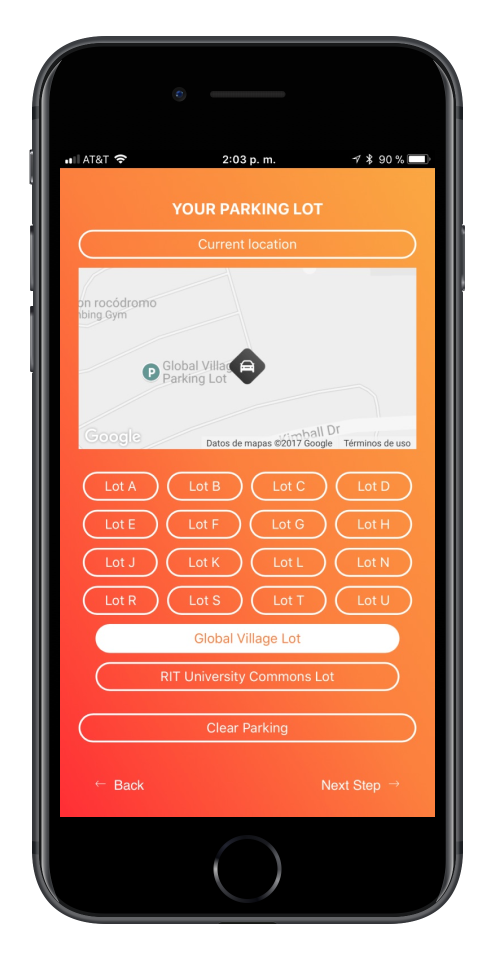
Parking
Since our app was meant to complement the Imagine RIT festival we had meetings with the Planning Committee in order to show our what we wanted to do, get some feedback, and take any suggestions. One suggestion they had was allowing users to save their parking spot. This came with a slight challenge as we weren’t guaranteed the user would know of the app before they parked and as such we had two ways of storing parking reminder. First they can set their current location as a reminder (geolocation from the previous step was necessary for this), otherwise they could select one of the multiple parking lots at RIT. The second option was less accurate but it would still be useful for people to get to those lots if they hadn’t been there before. These settings could be changed later in the profile page.
Interests
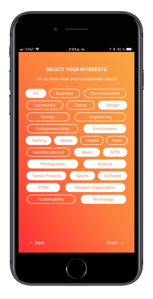
The last process of our setup was interest selection. Since we wanted to personalize the user’s experience by recommending exhibits we kept track of their interests. Using these recommendations we narrowed down the exhibits users would be most interested in. We also made sure to allow them to edit these interests at a later time.
Home
Pins
Once onboarding was completed we would dive the user right in the app. The home page had the map of the campus with the user centered in the map and showed the nearby booths represented by the orange pin. Since many exhibits were close to each other we applied a clustering technique that looked like merged pins. If the number of exhibits clustered were in the single digits, two pins would appear merged, otherwise it would be three. Pressing the clusters would zoom the user in.
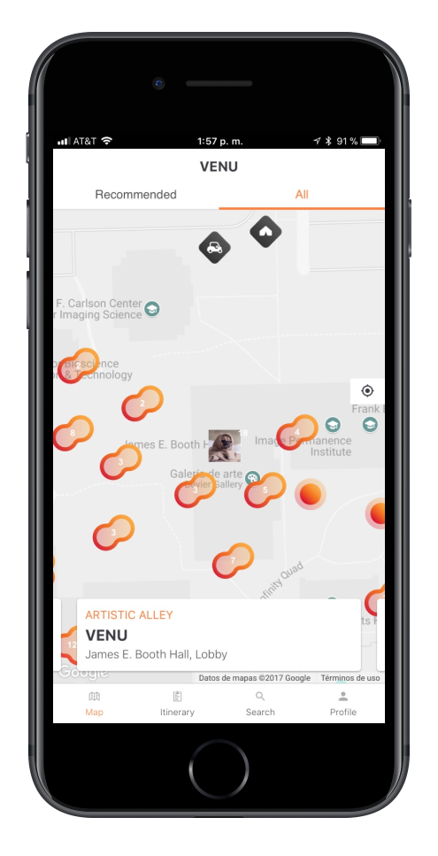
Exhibits have different states. These are normal which are the orange pins, bookmarked which are pins the user bookmarks and are represented by a blue color, and visited which are exhibits the user has marked as visited, they look like normal pins except faded out. Campus facilities also appear on the map and they are distinguished by the rounded black diamond with the facility type icon. The facilities were Dining, Restrooms, Welcome Centers, Information Booths, Medical Centers, and transportation such as Shuttles and Cars.
Recommended Exhibits
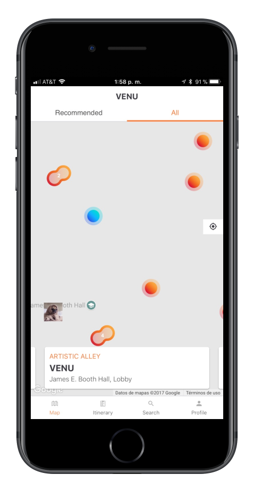
The home page had two states. A Recommended tab and an All tab. Originally the Recommended would show only the recommended exhibits however this was later changed after some feedback to show all of the exhibits. Instead the cards at the bottom of the screen would change. In the Recommended state, they would show the recommended exhibits by area. When the card is centered on the screen it would also center the map on the exhibit.On the All state the cards at the bottom would show bookmarked exhibits.
Itinerary
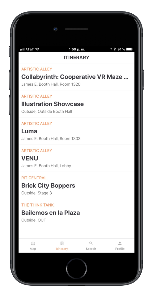
The second tab of the app was the Itinerary page. Here we would show a list of bookmarked exhibits as well as exhibits visited by the user. The visited exhibits were displayed last and had a different background differentiating them from bookmarked exhibits.
Search
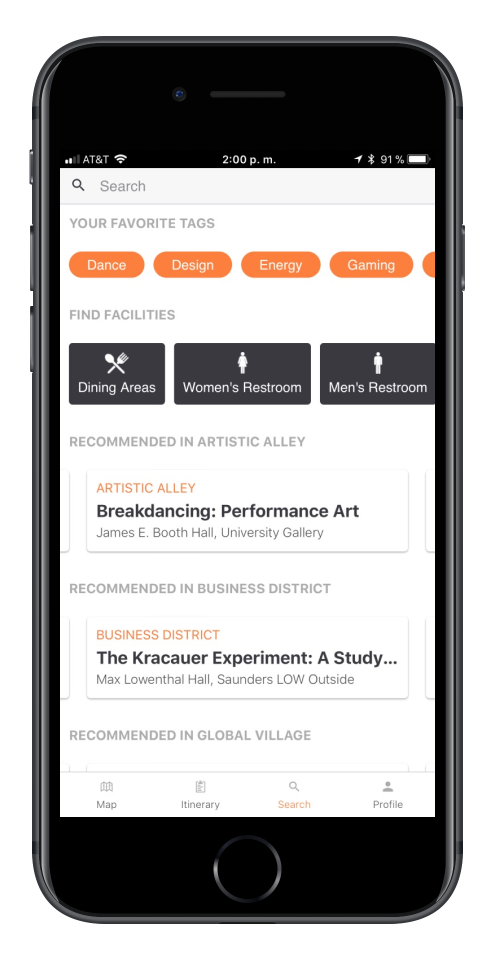
The search page has two states. A landing page and a page with search results. The landing page was meant to help people find exhibits quickly and to search for terms. We had the user’s interest list at the top and then the list of facilities. Pressing any of there would search for those immediately. We also included a list for every festival zone with at least 3 exhibits that matched the user’s interests.
Profile
The profile page was simple and had some stats such as places the user had bookmarked and visited. If also had action to change their interests and update their parking location. It also included a logout button.
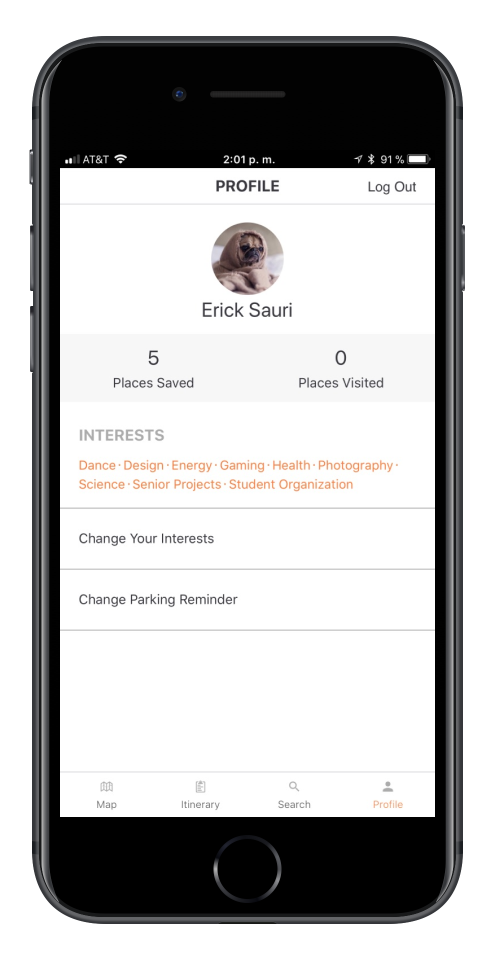
Exhibit Detail
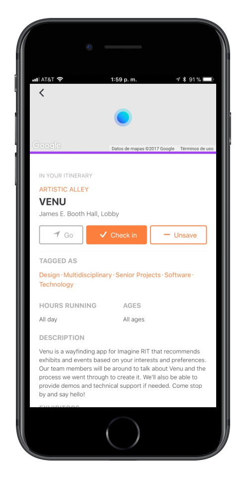
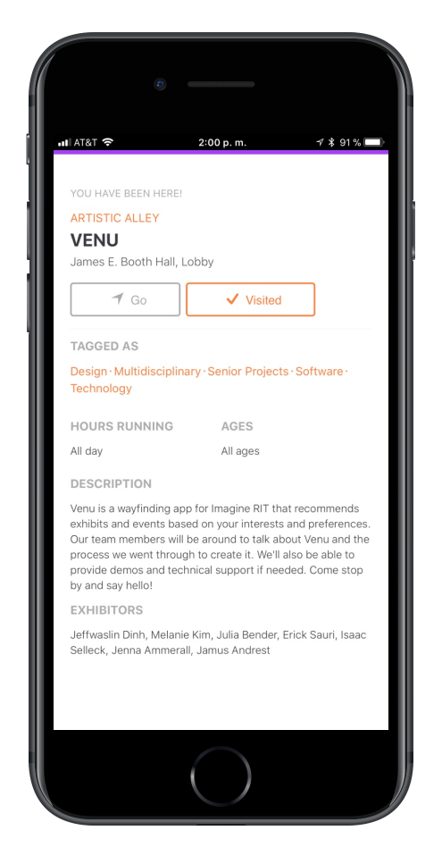
The exhibit page contains all the details available on an exhibit. It would open any time a pin, a card, or a list item on an exhibit (or facility) were pressed. The exhibit page contains information we had on an exhibit such as tags, the time it ran, the recommended age for visitors, the festival zone, building and room number. It also had a brief exhibit description and a list of people who ran the exhibit. Users could either bookmark the exhibit by pressing the Save button or mark the exhibit as visited by pressing the Check In button.
Directions
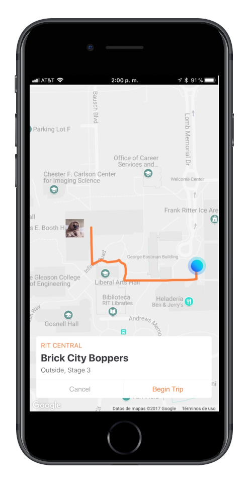
By pressing the Go button they were sent to the Directions page. There we used Google Maps Directions API to get a path from the user’s location to the exhibit location. We did notice that paths would act weirdly in the campus especially if the distance was not that far. Once the user had reached their destination they could mark the exhibit as visited.
VENU @ Imagine RIT
Parting Thoughts
VENU was a great experience as we were able to work on a multifaceted project with multiple members and responsibilities. We did learn many lessons doing the project such as communication being the key to success. Even if team members had prior obligations that conflicted with team meetings, it was better to know what was going on than to be in the dark. We also learned that it was difficult to generate awareness to people prior to the festival. We had access to the universities message center and had an interview with a local TV station we still wanted more people to learn about the app. Still we had about 950 people use the app and we were pleased. It was also important to stay focused on what mattered most and deliver on that even if it meant some things might not make it to the final product.
Overall it was an exciting project to work on. It took a lot of work for the group to create the product. I would like to thank my teammates for their awesome work! They did a great job from orginazation, conceptualization, to marketing, sketching, prototyping, editing, and data visualization: Jenna Ammerall, Jamus Andrest, Julia Bender, Jeffwaslin Dinh, Melanie Kim, and Isaac Selleck. As well as our New Media professors, Nancy Doubleday and Adam Smith, for all their help and guidance.
